
Picture Frame Layout for Narrow Hallways: A Complete Guide
A narrow hallway is often treated as nothing more than a passage between rooms. However, with a carefully planned picture […]
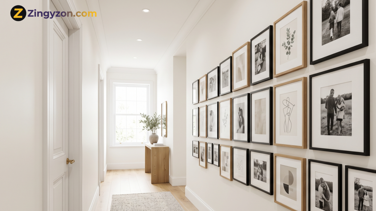
A narrow hallway is often treated as nothing more than a passage between rooms. However, with a carefully planned picture display, it can become one of the most personal and visually interesting areas in your home. The challenge is finding a picture frame layout for narrow hallways that adds character without making the space look smaller, darker, or cluttered.
Unlike a large living-room wall, a hallway is usually viewed while people are moving through it. The viewing distance is short, the lighting may be limited, and doors, switches, thermostats, or corners can interrupt the available wall space. Because of these restrictions, every frame size, gap, color, and alignment choice matters.
The good news is that you do not need a wide wall or an expensive art collection to create an attractive hallway gallery. Family photographs, travel images, small prints, sketches, postcards, and meaningful artwork can all work beautifully when arranged with intention.
This guide explains how to measure the space, choose a layout, determine frame spacing, select suitable frames, and avoid the mistakes that commonly make narrow hallways feel overcrowded.
Why Picture Frames Work Well in a Narrow Hallway
Hallways often have very little room for furniture or decorative objects. A console table may block movement, a large plant may feel awkward, and deep shelves can make the passage uncomfortable. Wall-mounted frames offer decoration without taking up valuable floor space.
A well-designed picture wall can also guide the eye along the length of the hallway. Horizontal arrangements make the passage feel connected, while vertical arrangements can draw attention upward and create the impression of a taller ceiling.
Artwork also adds warmth to spaces that may otherwise feel plain or unfinished. It allows homeowners to introduce color, personality, and meaningful memories without changing the physical layout of the hallway.
Picture frames are especially useful because the display can be adapted to almost any interior style. Matching black frames suit modern homes, natural wood frames add warmth, slim metal frames create a refined look, and mixed vintage frames can introduce personality.
The arrangement matters just as much as the frame style, so planning the layout before hanging anything is essential.
Measure the Hallway Before Choosing a Layout
The first step in planning a picture frame layout for narrow hallways is measuring the wall accurately. Do not estimate by eye because even a small measuring error can make a symmetrical arrangement look uneven.
Measure the total wall length, ceiling height, and usable area between doors, corners, light switches, vents, and other fixed features. You should also measure the width of the hallway.
The narrower the passage, the closer people will stand to the frames. This usually means small or medium-sized artwork will be easier to view than oversized pieces.
As a general starting point, the visual center of the arrangement should sit close to average eye level. In many homes, positioning the center around 57 to 60 inches from the floor creates a comfortable viewing height.
However, this should be treated as a guideline rather than a strict rule. A hallway used mainly by children, a staircase passage, or a wall above a bench may require a different height.
Before decorating, it may also help to address damaged paint, uneven surfaces, or outdated finishes. The practical ideas in this guide to DIY home renovation projects can help you prepare the hallway before installing a gallery wall.
Best Picture Frame Layouts for Narrow Hallways
There is no single arrangement that suits every hallway. The best choice depends on the wall length, ceiling height, number of frames, and overall style of the home.
The following picture frame layouts are particularly effective in tight passages.
1. Single Horizontal Row
A single row is one of the safest and cleanest layouts for a narrow hallway. Use frames of the same size and align their centers along one horizontal line.
This arrangement creates rhythm, leads the eye down the hall, and avoids unnecessary visual clutter.
Keep the gaps consistent and choose images with a connected theme, such as family photographs, botanical illustrations, architectural photography, or travel memories.
A single horizontal row is also easier to install than a free-form gallery wall because the alignment is clear and predictable.
This layout works especially well on a long, uninterrupted wall where people can view the photographs while walking through the hallway.
2. Vertical Stack
A vertical stack is useful when the available wall section is narrow or positioned between two doorways. Hang two, three, or four frames directly above one another with equal spacing.
This arrangement draws the eye upward, making it a strong choice for hallways with high ceilings.
Slim portrait-oriented frames work particularly well. Avoid using frames that are too wide because they can appear oversized when viewed from close range.
A vertical stack can be used to showcase a small collection, such as seasonal photographs, children’s portraits, architectural details, pressed flowers, or matching abstract prints.
3. Symmetrical Grid
A symmetrical grid creates a polished and organized appearance. It usually consists of four, six, or nine frames in matching sizes, arranged with identical horizontal and vertical gaps.
For a narrow hall, a two-row grid is often more suitable than a large square arrangement. For example, six frames arranged in two rows of three can provide impact without covering too much wall height.
A grid depends on precision. Frames must be level, gaps must remain consistent, and the artwork should have enough visual connection to feel like one collection.
Matching mats can help photographs or prints with different colors look more cohesive.
This layout is particularly suitable for family portraits, wedding photographs, black-and-white photography, botanical artwork, or a coordinated print collection.
4. Linear Gallery Wall
A linear gallery wall combines frames of different sizes while maintaining a clear central line.
Some frames sit above the line and others below it, but the overall arrangement still appears controlled and balanced.
This layout provides more variety than a single row while remaining suitable for a tight passage. It works best when the frames share one feature, such as the same finish, mat color, artwork style, or photographic treatment.
Start with the largest frame near the middle and place smaller pieces around it. Keep the total height moderate so the display does not dominate the hallway.
A linear gallery wall is a practical compromise between a strict grid and a completely free-form arrangement.
5. Salon-Style Arrangement
A salon-style gallery uses mixed frame sizes and a less rigid arrangement. It can feel artistic, collected, and highly personal, but it requires careful editing in a narrow space.
Choose one anchor piece and build the layout around it. Maintain relatively consistent gaps even though the frame sizes vary.
The outer edges do not need to form a perfect rectangle, but the visual weight should feel balanced.
This layout is most successful when the wall is long enough to give the arrangement breathing room. In a very short hallway, a crowded salon wall may make the space feel chaotic.
Limit the color palette and avoid combining too many heavy, colorful, or ornate frames.
6. Picture Ledge Display
A shallow picture ledge allows framed artwork to overlap slightly and makes it easy to update the display.
It is a flexible option for renters or homeowners who enjoy changing photographs, seasonal artwork, and decorative prints regularly.
The ledge must be shallow, securely installed, and positioned where shoulders, handbags, coats, or moving furniture will not hit it.
In a particularly tight hallway, standard wall-mounted frames may be safer than a projecting shelf.
Use a mix of two or three frame heights, but avoid adding so many overlapping pieces that the display becomes bulky.
Ideal Spacing Between Picture Frames
Consistent spacing is one of the most important details in a successful hallway gallery.
Large, random gaps can make related pieces feel disconnected. Gaps that are too small can make the arrangement look crowded and difficult to appreciate.
For most layouts, a gap of approximately 2 to 3 inches between frames provides a balanced starting point.
Smaller frames may look better with gaps closer to 1.5 or 2 inches. Larger frames may need approximately 3 to 4 inches of separation.
The specific measurement matters less than consistency. Choose one standard gap and use it throughout a grid or horizontal row.
In a mixed gallery, slight variations are acceptable, but the spaces should still appear intentional.
Remember that the gap is measured between the outer edges of the frames, not between the photographs or artwork inside them.
Wide mats, thick borders, and decorative frames can change the perceived spacing, so evaluate the arrangement as a complete visual composition.
Choose Frame Sizes That Suit Close Viewing
Large artwork can be dramatic in a spacious living room, but it may feel overwhelming in a narrow corridor where the viewer cannot step back.
Small and medium frames are generally easier to appreciate at close range.
Common frame sizes such as 5 x 7, 8 x 10, 11 x 14, and 12 x 16 inches offer plenty of flexibility.
You can use one size repeatedly for a clean grid or combine two to four sizes for a more relaxed arrangement.
The depth of the frames also deserves attention. Slim profiles usually feel lighter and occupy less visual space.
Thick, carved, or shadow-box frames can work as occasional accents, but using too many may make the hallway wall feel heavy.
For a cohesive result, repeat at least one element across the collection. This could be the frame color, mat style, artwork palette, frame material, or photographic treatment.
For example, photographs can be different sizes while still looking coordinated when they all use white mats and thin black frames.
Pick Artwork With a Clear Visual Connection
A gallery wall feels more intentional when the images share a theme, color palette, subject, or mood.
They do not need to match exactly, but there should be an obvious relationship between them.
Suitable themes include:
- Family photographs
- Travel photography
- Botanical illustrations
- Architectural sketches
- Abstract artwork
- Vintage postcards
- Maps and book pages
- Children’s artwork
- Nature photography
- Black-and-white portraits
Black-and-white photography is particularly effective in narrow hallways because it reduces visual noise and allows different photographs to feel connected.
Color images can also work beautifully when their tones coordinate with the runner, wall paint, flooring, doors, nearby rooms, or lighting.
Avoid filling every frame with a highly detailed or brightly colored image. A few quieter pieces can give the eye a place to rest and prevent the wall from feeling too busy.
Plan the Layout on the Floor First
Before making holes in the wall, arrange the frames on the floor.
Use the same approximate dimensions as the available wall area and test several different compositions.
Start with the largest or most meaningful frame. Add the remaining pieces around it while maintaining the desired spacing.
Take a photograph of each arrangement so you can compare different options before choosing the final layout.
Once you have selected an arrangement, trace each frame onto paper. Cut out the templates and attach them to the wall with painter’s tape.
This allows you to check the height, spacing, scale, and relationship to doors before installing any hardware.
Walk through the hallway several times and view the paper arrangement from both directions.
A layout that looks balanced from one end may feel uneven from the other. Adjust the templates until the arrangement works from the hallway’s main entry points.
This planning stage also supports better use of limited space. For additional ideas on keeping compact areas functional and visually calm, explore these home organization ideas for small spaces.
How to Hang Frames Straight and Securely
Choose hanging hardware according to the frame weight and wall type.
Lightweight frames may only require simple picture hooks, while heavier pieces may need wall anchors, screws, or specialist hanging hardware.
Do not rely on weak adhesive strips for valuable or heavy artwork unless the product is specifically rated for the frame’s weight and the type of wall surface.
Use a measuring tape, pencil, and level during installation. Measure the location of each frame’s hook or wire rather than assuming the hanging point is positioned directly in the center.
For a large row or symmetrical grid, a laser level can make alignment easier.
Frames in hallways are more likely to be bumped by people, handbags, vacuum cleaners, coats, or moving furniture.
Small adhesive bumpers placed on the lower corners can prevent frames from shifting and protect the wall from marks.
Security hangers may be worthwhile in busy households or hallways used by children.
After hanging the display, stand at both ends of the hall and inspect the alignment.
Small adjustments can make a major difference, especially in symmetrical grids and horizontal rows.
Use Lighting to Improve the Display
Even a well-designed gallery can disappear in a dark hallway. Good lighting helps people see the artwork and makes the passage feel more welcoming.
Ceiling spotlights, track lighting, wall washers, recessed lights, and slim picture lights can all work.
The best option depends on the electrical layout, ceiling height, wall width, and number of frames.
Aim for soft and even illumination rather than harsh light that creates glare directly on the glass.
If the frames face a window or strong light source, non-reflective glazing may improve visibility.
Keep the light color consistent throughout the hallway. Mixing very warm and very cool bulbs can make the artwork and wall color look uneven.
Warm white lighting usually creates a comfortable residential atmosphere, while neutral white lighting can make modern artwork appear sharper and clearer.
Common Picture Frame Layout Mistakes to Avoid
Hanging the Arrangement Too High
When frames are placed too close to the ceiling, they can feel disconnected from the viewer.
Base the height on the visual center of the entire arrangement rather than the top edge of an individual frame.
Using Frames That Are Too Large
Oversized artwork may be difficult to view in a tight hallway.
Test the scale with paper templates before purchasing or hanging large frames.
One carefully selected large piece may work better than several oversized frames placed close together.
Leaving Uneven Gaps
Inconsistent spacing can make even expensive frames look poorly arranged.
Measure every gap instead of relying entirely on visual judgment.
Ignoring Doors and Switches
A display should work with architectural features rather than appearing squeezed around them.
Treat doors, switches, thermostats, vents, and wall controls as part of the overall composition.
Mixing Too Many Styles
An eclectic display still needs a connecting element.
Limit frame finishes, artwork colors, image themes, or mat styles to create unity.
Filling Every Inch of Wall
More frames do not always create more impact.
Open wall space around the arrangement allows each image to be seen clearly and prevents the hallway from feeling crowded.
Forgetting the Viewing Direction
People usually see a hallway gallery while approaching it from either end.
Check the visual balance from both directions, not only while standing directly in front of the display.
Choosing Frames That Project Too Far
Deep shadow boxes, thick shelves, and bulky decorative frames can reduce comfortable movement through a narrow passage.
Choose slim profiles unless there is enough hallway width to support deeper frames safely.
Ignoring the Existing Decor
A busy gallery wall combined with patterned wallpaper, an elaborate runner, bold doors, and decorative lighting may overwhelm the space.
Decide which feature should be the main focal point and keep the surrounding details more controlled.
Final Thoughts
The best picture frame layout for narrow hallways is not necessarily the largest or most complicated.
It is the arrangement that respects the available space, remains easy to view, and connects naturally with the rest of the home.
A single row creates a clean and spacious effect. A grid provides structure and symmetry. A vertical stack makes effective use of small wall sections, while a carefully edited salon arrangement adds personality.
Regardless of the style you choose, accurate measurements, consistent spacing, suitable frame sizes, secure hardware, and thoughtful lighting will determine the final result.
Take time to test the design with floor arrangements and paper templates before hanging anything.
This simple preparation can prevent unnecessary wall damage and help you create a hallway gallery that looks intentional from every angle.
With the right balance of artwork and open space, even the narrowest hallway can become a meaningful part of your home rather than an overlooked passage.
Frequently Asked Questions
What is the best frame layout for a very narrow hallway?
A single horizontal row or vertical stack is usually the safest option. Both layouts are easy to view at close range and create less visual clutter than a large mixed gallery wall.
How far apart should picture frames be in a hallway?
A gap of about 2 to 3 inches works well for many arrangements. Small frames can be placed slightly closer, while large frames may require more space. Consistency is more important than using one exact measurement.
Should hallway picture frames all match?
They do not have to match, but they should share at least one feature. Using the same color, material, mat style, photographic treatment, or artwork palette helps different frames feel connected.
How high should pictures be hung in a hallway?
As a starting point, place the visual center of the complete arrangement around 57 to 60 inches from the floor. Adjust this according to ceiling height, furniture, household needs, and nearby architectural features.
Can I use large artwork in a narrow hallway?
Yes, but it should be tested carefully because viewers cannot step far back. One large, slim piece may work better than several oversized frames. Paper templates can help you judge the scale before hanging anything.
Are picture ledges suitable for narrow hallways?
A picture ledge can work when it is shallow, securely installed, and positioned away from regular foot traffic. In an extremely narrow hallway, flat wall-mounted frames are generally safer.
What frame color works best in a small hallway?
Slim black, white, natural wood, or light metallic frames usually work well. Choose a finish that complements the wall color, doors, flooring, lighting fixtures, and nearby rooms.
Keep Exploring Zingyzon.com
Read more Zingyzon SEO, digital marketing, online earning, business, and technology guides for Australia, USA, and global readers.